


By: Fanfan Yuxuan Fan
From the title sequence of an Emmy Award–winning creator’s series, to a Clio Gold–winning museum rebrand, to screens in TurboTax stores nationwide, three keyframes in the rise of a motion designer whose work now reaches audiences across America.
In animation, a keyframe is the frame that matters most. It defines where a movement starts, where it lands, and what shape the motion takes along the way. Animators set keyframes deliberately, and everything else exists to connect them.
For New York–based motion designer Xiangrui “Ray” Chen, the term has become a way of describing her own career. In the span of a few years, she has assembled the kind of portfolio many designers spend a decade pursuing: a signature title sequence, an award-sweeping rebrand, and animation for a Fortune 500 brand that has played on retail screens across the United States. Each change of job, she says, was less a leap than a keyframe, a position set with intention.
Chen trained in graphic design at Renmin University of China before earning her MFA in Computer Art at the School of Visual Arts (SVA) in New York. Told frame by frame, her path is a story about influence: how one designer’s choices can shape the feel of a series, contribute to the motion language of an award-sweeping rebrand, and reach millions of Americans through a single brand.
The Designer an Emmy Winner Trusted
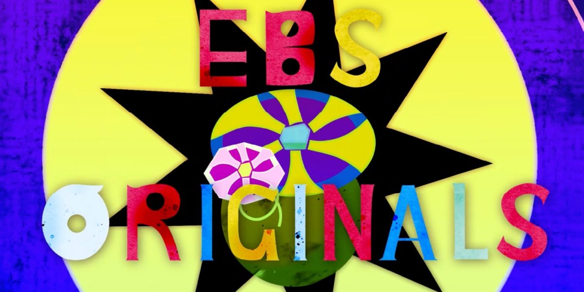
Chen’s professional debut came through the SVA job board, and it placed her, straight out of her MFA, alongside Broadway-caliber talent. She animated the title sequence for “Leenie’s Library,” a picture-book musical series created by two-time Emmy Award–winning lyricist and playwright Eileen Bluestone Sherman. The series teaches reading, spelling, and vocabulary through song, a full-scale production involving Broadway vocalists, a live ensemble of nine-plus musicians, and recording studios in New York and Vermont. For the opening audiences would see first, every single episode, the team turned to Chen.
At the time, Chen was absorbed in exploring the meeting point of illustration and motion. What she remembers most, though, is a coffee shop. It was her first time sitting across from a client as an independent designer, and the first question was disarmingly practical: “How long will this take?”
“I realized in that moment that being a designer isn’t just about making beautiful frames,” Chen recalls. “It’s about making someone trust you with their project.”
Her answer was structure. She organized the production the way her school ran weekly reviews: regular meetings, visible progress, decisions documented. And when the client asked for a palette that felt more childlike and energetic, she scrapped her first version, which skewed softer and more feminine, and rebuilt it. The revision taught her something she has carried ever since. In motion design, the concept and design phase is not preparation for the work. It is the work.
Chen designed and animated the 20-second opening sequence, taking it from concept and asset design through final animation. That sequence opens every episode of the series. The series has also earned recognition beyond the screen: its song “At Mr. Weintraub’s Grocery Store” was named a finalist in the Best Kids Music Video category at the GramoFrame Music Video Awards and an Official Selection at the SIMI Music Video Fest, both in 2026, while “Rotten Apples” was named a Semi-Finalist in the Music Video category of the 2025 International Songwriting Competition.
Craft Under Pressure
What followed was a stretch of rapid growth. Chen moved through New York’s creative agencies, building a cross-platform visual system for the global stroller brand Bugaboo at The Working Assembly, and producing a motion toolkit at Compadre for the “MLB The Show” campaign made with ESPN. Her technical range sharpened fast. What she wanted next was a stage that would demand all of it at once.
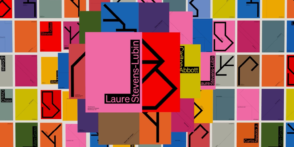
She found it at MullenLowe Design Studio (which has since been folded into TBWA following the Omnicom-IPG merger), ranked the third most awarded design agency in North America by D&AD, where Chen joined the team behind the rebrand of The Branch Museum of Design, a museum housed in a 1919 Tudor-style building in Richmond, Virginia, designed by architect John Russell Pope. Rather than flattening the building’s history into a fashionable minimalist logo, the team translated its century-old architecture into a living design system. The project swept the industry’s 2026 award season, winning a Clio Gold in Design for Brand Identity: Refresh and Best Rebrand at the Ad Age Creativity Awards, along with two Bronze Cubes at the ADC 105th Annual Awards, one of them in Motion / Film Craft for Animated Logo, plus two ADC Merit honors and recognition from Communication Arts.
Chen worked on the motion side of the project as a motion design intern on the studio’s motion design team. She animated some of the film’s most technically demanding shots, among them a 2.5D treatment that turned hundreds of static posters into one of the film’s most striking dimensional moments.
One key shot went through seven or eight rounds of review, each round producing anywhere from one to five versions, the kind of exacting process reserved for work expected to compete at the industry’s highest level.
“That shot taught me both sides of this profession at once,” Chen says. “As an artist, you want to keep experimenting with the craft. As a designer, you feel the anxiety of every revision. I was lucky; the client was patient and generous with direction, and they were brilliant designers themselves. They didn’t just approve or reject; they guided.”
The Branch project crystallized the two capacities that now define her work. As a brand storyteller, she saw how motion itself can carry meaning a static identity cannot. As a craftsperson, she emerged with a workflow tested under high-pressure, high-precision production.
Motion Inside the Frame
Chen’s most recent keyframe played out on a national stage. As a motion designer at Intuit, she created animation for TurboTax, one of the most recognizable brands in American life, including the digital screens inside the 20 dedicated retail stores the brand opened across the United States at the start of this year, among them a SoHo flagship built around The Forum, a 30-foot digital screen.
The brief was harder than it sounds. Every animation had to stay true to Intuit’s brand system while carrying a message that felt confident and warm, taking a subject most people find stressful and making it feel clear, calm, even friendly. It was design at Fortune 500 scale, where the margin for ambiguity was effectively zero.
“It was my first time approaching animation through a framework this strict, against standards this abstract,” Chen says. “There’s no director asking for ‘more drama.’ The measure is whether it feels confident, and whether it feels warm. You learn a completely different kind of precision.”
Her animations passed that filter and went on to play on store screens across the country; brand storytelling encountered not in a showreel but in the middle of daily life.
The In-Betweens
In animation, keyframes determine the direction of a motion, and the software fills in the frames between. Careers, Chen points out, work the other way around. Nobody fills in the in-betweens for you. But the principle holds. Set the key positions deliberately, and the movement finds its shape.
Chen keeps setting new keyframes, each one larger in scale and reach than the last. The motion, frame by frame, is still accelerating.
Chen’s animation and illustration work is collected on her motion design portfolio, with case studies in her selected project archive and process notes on her design and illustration Instagram.