Documenting Love and Loss: How Personal Writing Keeps Memory Alive

By: Jay Kt

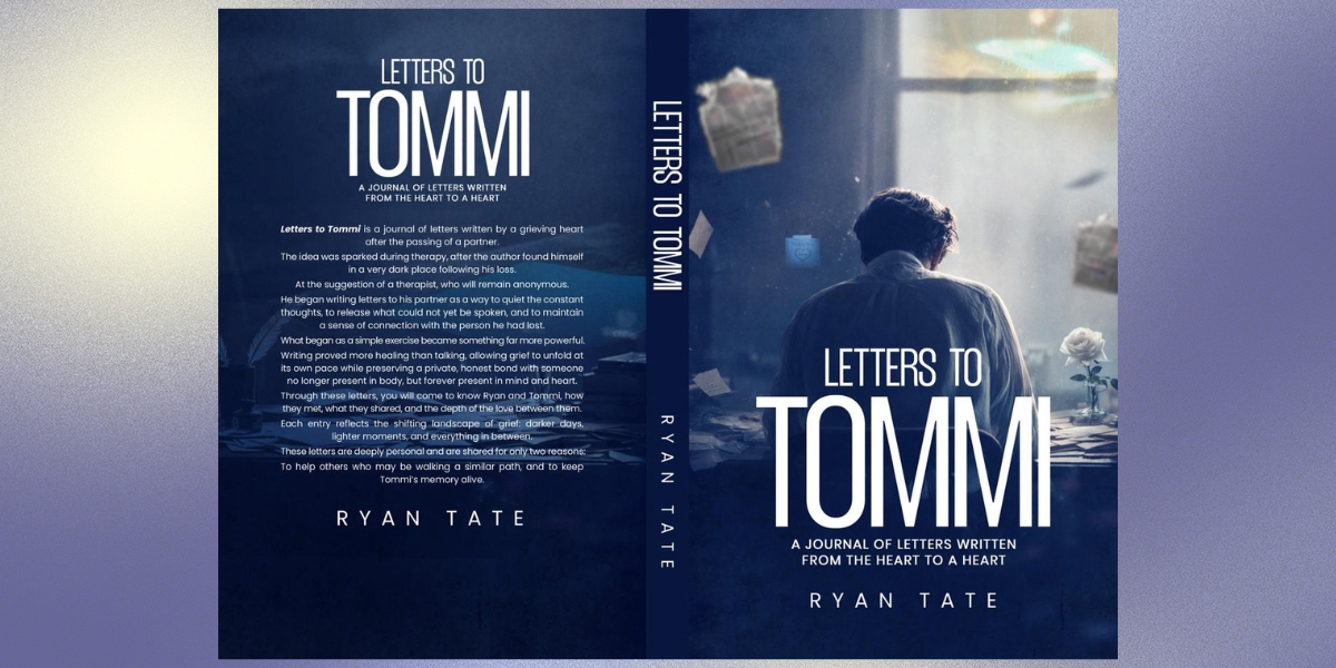
Letters to Tommi is, at its heart, a story about love, memory, and the unexpected ways in which the people we lose remain part of our lives. Written by British author Ryan Tate, the memoir began not as a book, but as a private collection of letters addressed to his late fiancé, Tuomas “Tommi.” Writing was initially suggested during counselling as a way for Ryan to express thoughts and emotions following Tommi’s sudden death in December 2025. What began as a personal exercise gradually became something more: a record of a relationship, a life shared, and a love that continued to have meaning beyond loss.

Rather than presenting grief as a straightforward journey from sorrow to recovery, Letters to Tommi captures something more human. Its letters move between sadness and humour, ordinary memories and extraordinary moments, allowing the personality of the man at their centre to remain present throughout.

A Love Story Across Borders

Ryan and Tommi’s story began unexpectedly during a holiday. Ryan was from the United Kingdom and Tommi from Finland, but what started as a chance meeting quickly developed into a relationship neither had anticipated.

Their connection crossed more than geographical borders. From the excitement of their earliest days together came the practical reality of creating a shared life in England while navigating the complications that can accompany an international relationship.

Those challenges became part of their story rather than its definition.

The couple built their relationship through the routines that make a partnership a life: travelling together, sharing a home, making plans, disagreeing over small things, laughing at each other’s habits and gradually becoming part of one another’s families.

Their future was taking shape too. Ryan and Tommi became engaged and planned to marry in Finland. Beyond marriage, they talked about eventually moving together to Italy, another chapter in a life they expected to continue writing side by side.

Those plans were never realised. Tommi died suddenly in December 2025, leaving Ryan facing not only the loss of the person he loved, but also the future they had imagined together.

Remembering The Person Behind The Loss

One of the most affecting qualities of Letters to Tommi is its attention to seemingly insignificant details. Tommi is remembered not simply as someone who died, but as someone who lived.

The letters recall the notes left in pockets, familiar clothes, glasses used for reading, private expressions, moments of affection, minor arguments, and the distinctive habits that become deeply familiar when two people share their lives.

These details give the memoir much of its warmth.

Grief can turn a person into a collection of dates and major events, but memory often works differently. It preserves a gesture, an expression, a joke, an item of clothing, or something once said in passing.

Through his letters, Ryan records those fragments before time has the opportunity to soften their edges.

The result is a portrait built from ordinary life. Tommi emerges through the pages not as an abstract symbol of loss, but as a partner with humour, habits, imperfections and a personality that shaped the relationship around him. It is within those details that Letters to Tommi becomes as much a book about love as it is about bereavement.

From Private Letters To A Shared Story

The letters were originally written without an audience in mind. That private beginning gives the book much of its directness. Ryan was not initially attempting to explain grief to other people or provide instructions for navigating it. He was writing to Tommi.

The letters therefore capture emotions as they appeared rather than arranging them into a neat sequence. Some revisit the earliest days of their relationship. Others reflect on their engagement, shared travels, domestic routines and plans for the future. There are moments of isolation and sadness, but also affection, humour and gratitude for the time they had together.

That movement reflects the unpredictable nature of memory itself. A difficult day can unexpectedly produce a happy recollection, while an ordinary object can suddenly bring back an entire moment.

Over time, the letters became a way of preserving not only what had been lost, but what had existed.

Writing As A Way Of Continuing The Conversation

The idea of writing to someone who is no longer physically present may seem unusual, yet personal writing can create a space in which thoughts that have nowhere else to go can still be expressed.

For Ryan, the letters became an ongoing conversation.

They allowed him to record memories as they surfaced, revisit moments from their relationship, and put into words emotions that could be difficult to express elsewhere.

There is no suggestion within Letters to Tommi that grief follows a timetable or that writing provides a simple route out of it. Instead, the memoir presents writing as one way of living alongside loss while protecting the memories that existed before it.

That distinction is important.

The story is not about leaving Tommi behind. It is about discovering how a life can continue while the person who helped shape it remains part of its emotional landscape.

Love Beyond Loss

The later letters increasingly consider what it means to carry memories forward.

Acceptance within the book does not require forgetting, nor does continuing with life diminish the importance of what came before. Instead, the letters suggest that love can change its form without losing its significance.

For readers who have experienced bereavement, that idea may be one of the book’s most hopeful qualities. Loss inevitably changes a life, but it cannot rewrite the life that preceded it. The holidays happened. The laughter happened. The arguments, reconciliations, plans, and quiet moments happened. The love happened.

Writing them down ensures those moments have somewhere to remain.

What began as one man writing privately to the person he missed therefore became something capable of speaking to a much wider audience. Not because every experience of grief is the same, but because the instinct to remember someone we love is deeply human.

Letters to Tommi ultimately preserves more than the experience of losing Tommi. It preserves the story of knowing him.

And within its pages, the relationship remains what it was before grief entered the story: a love between two people who met unexpectedly, built a life together, and believed they had much more of it still ahead.

About The Author

Ryan Tate is the British author of Letters to Tommi: A Journal of Letters Written from the Heart to a Heart. The book grew from private letters written following the sudden death of his fiancé, Tuomas “Tommi,” and explores love, memory, bereavement, and the enduring place that those we have loved can continue to hold in our lives.

Website: letterstotommi.com

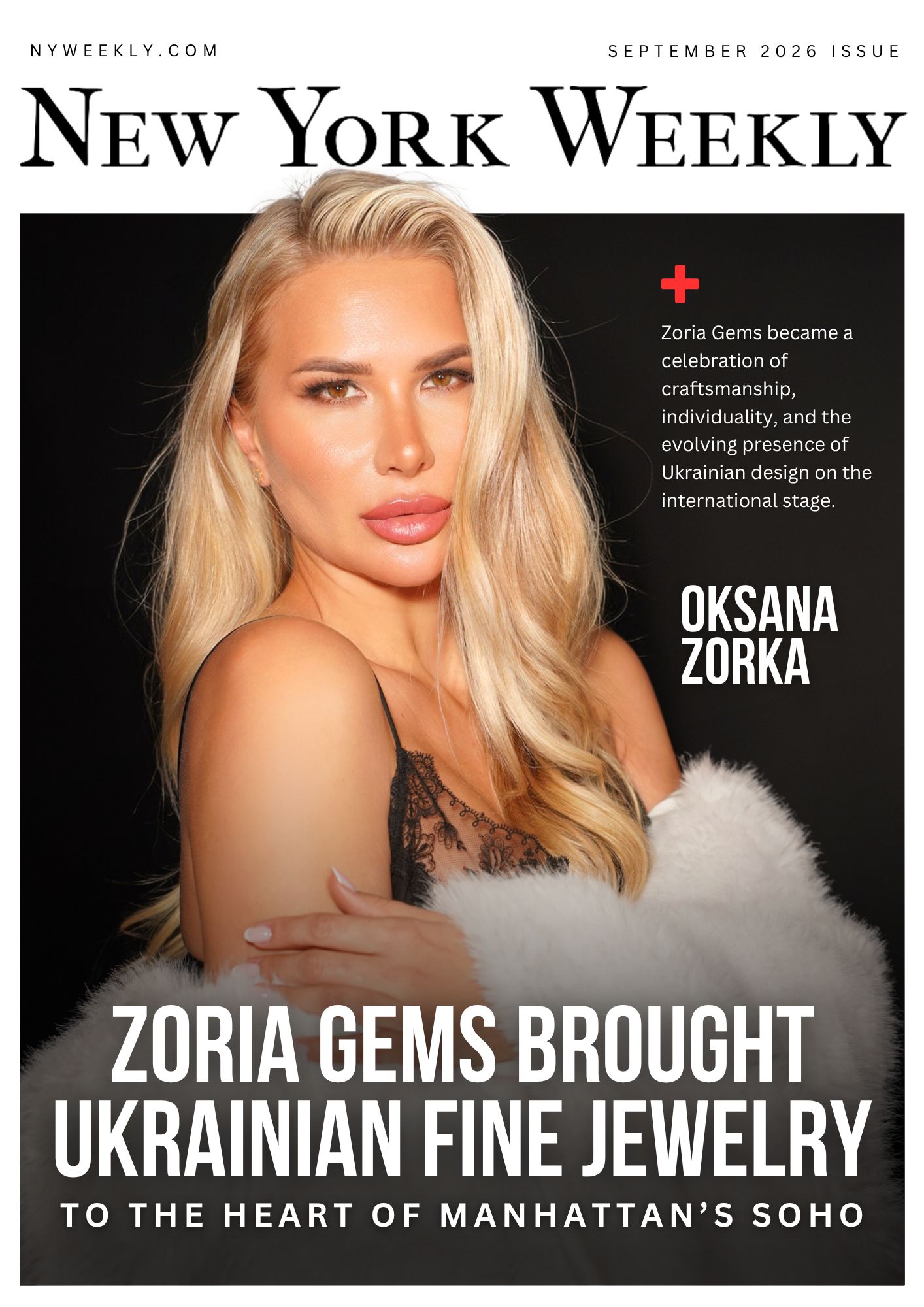
Zoria Gems Brought Ukrainian Fine Jewelry to the Heart of Manhattan’s SoHo

From August 25 through August 31, Zoria Gems presented its first New York Pop-Up in the heart of Manhattan’s iconic SoHo, introducing the city to a distinctive vision of contemporary Ukrainian fine jewelry. The week-long presentation took place at 21 Spring Street as part of Ukrainian Fashion 4 Ukraine and became an opportunity for New York audiences to discover not only the brand’s collections, but also the craftsmanship, emotion, and creative identity behind them.

Founded and creatively directed by Oksana Zorka, Zoria Gems was presented as a jewelry brand built around individuality, symbolism, and personal expression. Rather than approaching jewelry simply as an accessory, the brand focuses on creating pieces intended to carry meaning and become part of the wearer’s own story.

Throughout the Pop-Up, visitors were able to explore Zoria Gems pieces in an intimate setting, experience the designs up close, and discover the details that define the brand’s aesthetic. Gemstones, sculptural forms, refined craftsmanship, and a sense of emotional storytelling are central to the Zoria Gems identity.

For Oksana Zorka, the New York presentation represented an important moment for the brand. Bringing Zoria Gems to Manhattan allowed her to introduce the collection to an international audience in one of the world’s most influential fashion and cultural capitals.

SoHo provided a particularly fitting setting. Known for its galleries, independent boutiques, fashion houses, design studios, and creative community, the neighborhood has long been associated with experimentation and artistic expression. Against that backdrop, Zoria Gems joined a wider conversation about contemporary design and the growing international presence of Ukrainian creative talent.

The Pop-Up also became part of a broader showcase of Ukrainian fashion and accessories. Visitors had the opportunity to discover additional Ukrainian brands, explore new collections, try on pieces, and engage directly with designers and representatives.

This collaborative format reflected one of the larger ideas behind Ukrainian Fashion 4 Ukraine: creating visibility for Ukrainian creatives abroad and presenting Ukrainian design as modern, sophisticated, and internationally relevant.

Ukrainian designers have become increasingly visible across global fashion, jewelry, art, and creative industries. Their work often combines strong craftsmanship with deeply personal narratives, cultural references, and a distinctly contemporary approach. Events such as the Zoria Gems Pop-Up help bring those stories into new markets and create direct connections between Ukrainian creators and international audiences.

For Zoria Gems, storytelling remains at the center of the brand’s philosophy. Each piece is conceived not only as an object of beauty, but as something that can reflect personality, memory, emotion, or transformation.

Jewelry often accompanies important moments in a person’s life. It can mark a celebration, preserve a memory, become a gift, or simply represent a feeling that is difficult to express in words. Zoria Gems embraces this emotional dimension and uses gemstones, shape, proportion, and detail to create pieces designed to feel personal.

The New York Pop-Up gave guests an opportunity to experience that philosophy in person. Instead of encountering the collection only through photographs or digital platforms, visitors could see the stones under natural light, understand the scale and construction of each piece, try jewelry on, and experience how a design changes when it becomes part of an individual look.

That personal interaction is particularly significant in fine jewelry, where craftsmanship and materiality are often best understood up close.

The presentation also demonstrated how jewelry can exist at the intersection of fashion and art. While every Zoria Gems piece is intended to be worn, the designs also function as small sculptural objects, shaped by composition, texture, color, and movement.

For international audiences discovering Ukrainian brands for the first time, the Pop-Up offered another perspective on the country’s creative output. Ukrainian design today extends far beyond traditional references. It is diverse, experimental, elegant, global, and increasingly represented in cities such as New York, Paris, London, and Milan.

Zoria Gems Brought Ukrainian Fine Jewelry to the Heart of Manhattan’s SoHo

Photo Courtesy: Oksana Zorka / New York Weekly

At the same time, Ukrainian creatives continue to carry a strong sense of identity into their work. That combination of international vision and personal cultural perspective has become one of the defining strengths of the contemporary Ukrainian creative scene.

The Zoria Gems Pop-Up concluded on August 31 after a full week at 21 Spring Street. During its time in SoHo, the project created a temporary space where jewelry, fashion, design, and Ukrainian creativity could meet a New York audience.

For the brand, the presentation marked another step in building an international presence and developing relationships beyond its home market.

Most importantly, the Pop-Up introduced visitors to the central idea behind Zoria Gems: jewelry can be more than decoration. It can carry emotion, express character, preserve memories, and become connected to the person who chooses to wear it.

By bringing that philosophy to Manhattan, Zoria Gems transformed its first New York Pop-Up into more than a retail presentation. It became a celebration of craftsmanship, individuality, and the evolving presence of Ukrainian design on the international stage.

The Five Minutes That Are Just Hers

Built on more than four decades of Singaporean formulation experience, Blé de Fonty (pronounced “Blay de Fon-tee”) is making a relatively modest proposition to American women:

Skincare does not necessarily need to become more complicated.

It can simply become more intentional.

Think about the last thing you did that was entirely for yourself.

Not sleep, which is necessary. Not the shower you rushed through while thinking about everything that had to happen next. Something you chose to do simply because, for a few minutes, it felt good to take care of yourself.

For many people, those moments are surprisingly scarce.

The beauty and wellness industries have traditionally offered ambitious solutions to that problem: elaborate routines, 90-minute facials, weekend retreats and bathroom shelves crowded with products.

Blé de Fonty is making a smaller argument.

Five minutes. At night. With your own hands.

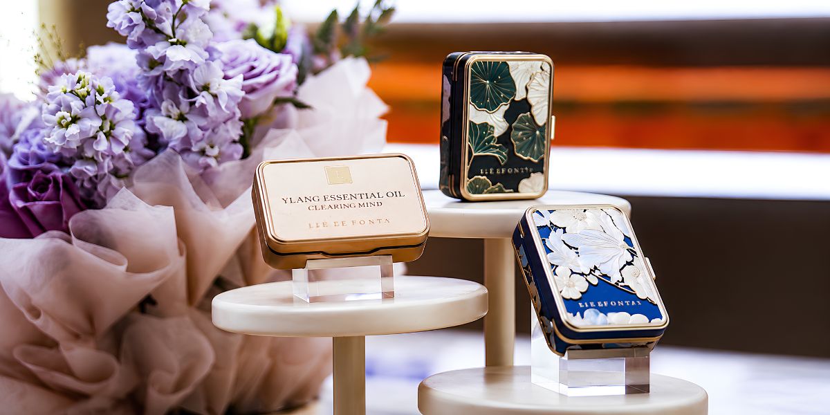
The Singapore-born skincare brand packages its serums as Beauty Pearls, individual capsules designed to be opened immediately before application. Each pearl contains a measured amount of serum, eliminating much of the guesswork of dispensing a product while limiting repeated exposure of the remaining formula to air.

According to the company, the capsules are nitrogen-sealed to help preserve formula integrity until they are opened. Their compact format also makes them easy to travel with.

The ritual itself is deliberately uncomplicated.

Open a pearl. Warm the serum between your palms. Press it into the skin. Then spend a few minutes massaging your face with your hands, a gua sha stone or a facial roller.

There is nothing particularly radical about the motions.

Perhaps that is the point.

Unlike the few minutes we routinely lose to scrolling, answering messages or completing one more task, this ritual asks for attention. For cofounder Kris Yap, that is part of what the product is meant to offer: a small pocket of time that belongs entirely to the person using it.

Not an elaborate indulgence.

A manageable ritual of daily attention.

The Woman Who Grew Up Around the Formulas

Kris Yap did not arrive in skincare through a passing beauty trend or a particularly memorable spa vacation.

She grew up around the business that made the formulas.

Her family established a skincare manufacturing company in Singapore in 1979 and spent the following decades developing serums for professional spas across Asia. Much of that work happened behind treatment-room doors, creating formulas for estheticians and premium spa environments rather than retail shelves.

Yap represents the second generation of that family business.

Working with a cofounding team whose members connected through INSEAD, she helped translate decades of professional formulation experience into a consumer-facing brand.

The idea was to bring elements of the professional spa experience (considered formulations, freshness and ritual) into the home, where they could become part of ordinary life rather than something reserved for occasional appointments.

Blé de Fonty says it has since served more than 500,000 women across Asia and France. Its footprint includes Singapore and Shanghai, a presence at Jewel Changi Airport and a spa partnership in Paris.

In 2026, the brand began its expansion into the United States.

Why the Serum Comes in a Pearl

Behind the ritual is a formulation decision that distinguishes Blé de Fonty from many conventional serums.

Instead of making water the primary foundation of its formulas, the company builds its Beauty Pearls around squalane and botanical oils selected for their compatibility, texture, and skin feel.

Its Golden Shield™ Lipid Technology combines squalane with jojoba oil, French wheat germ oil and macadamia oil, creating the lipid foundation used across the range.

The formulas are then differentiated with ingredients selected for specific areas and concerns.

The pearl itself is not merely decorative packaging.

Each capsule contains a measured application and is nitrogen-sealed to limit exposure before use. According to Blé de Fonty, the Beauty Pearls are filled using processes inspired by pharmaceutical manufacturing and sealed shortly after filling.

Rather than opening the same bottle every night, the user opens one pearl at a time.

It is a small design choice, but one that reinforces the larger philosophy of the brand: make each application deliberate.

Precision Rather Than More Products

Blé de Fonty does not treat the face, lips, jawline, neck and body as interchangeable surfaces.

Its products share the same lipid-based philosophy, but each formula incorporates ingredients selected for the area being cared for.

The Night Beauty Pearls, for example, combine botanical oils, peptides and pomegranate extract in a richer serum intended for overnight facial care.

The Jawline Beauty Pearls are paired with massage and feature coffee-derived ingredients, bakuchiol and peptides.

The Neck Beauty Pearls combine peptides, botanical oils and ceramides in a formula developed specifically for the neck and décolletage.

The same philosophy extends across products for the lips and body.

Different areas have different characteristics and therefore do not necessarily require identical care.

This is not about adding another arbitrary step to an already crowded routine.

It is about making the steps you choose feel more considered.

Fewer generalizations. More precision.

Five Minutes That Feel Like an Investment in Yourself

And this is where the Beauty Pearl becomes something more than a delivery system.

Warm the serum between your palms.

Press it into your skin.

Spend a few minutes massaging your face.

For five minutes, there is nowhere else you particularly need to be.

After a day dominated by obligations, messages, schedules, and other people’s needs, that brief ritual creates a little space of your own. The warmth of the serum, the facial massage and the sensorial experience transform an ordinary skincare step into a conscious act of slowing down.

Five minutes cannot change everything about your day.

But they can change how you end it.

For Blé de Fonty, that is the point.

A New Chapter in the United States

Blé de Fonty’s Beauty Pearls are now available to U.S. customers and as part of its American debut, the company is also introducing a Founding Member Program, selecting 50 women to experience the products and share candid feedback as the brand establishes itself in the United States.

It is an appropriately intimate beginning for a company whose central proposition is itself surprisingly small:

Sometimes five minutes is enough.

Naomi Osaka’s US Open Entrance Becomes a New York Fashion Moment

Naomi Osaka’s US Open entrance brought an Allen Iverson-inspired fashion concept to Arthur Ashe Stadium before the two-time champion defeated Anastasia Zakharova in straight sets. Styled by Law Roach and dressed by Who Decides War, Osaka connected basketball references, New York streetwear and her own career imagery in one pre-match reveal.

Key Takeaways

  • Osaka entered Arthur Ashe Stadium in a custom Who Decides War look styled by Law Roach before changing into her Nike match kit
  • The entrance referenced Allen Iverson through cornrows, a headband, arm sleeves and basketball-influenced styling
  • Who Decides War designers Téla D’Amore and Ev Bravado said they had roughly 30 hours to develop the custom look
  • Osaka defeated Anastasia Zakharova 7-6 (6), 7-6 (3) in the first round on Aug. 31

Naomi Osaka’s US Open Entrance Centers an Iverson Tribute

NEW YORK, Aug. 31, 2026. Naomi Osaka walked into Arthur Ashe Stadium for her first-round US Open match wearing a long white tulle skirt with a gray hooded layer covered in newspaper clippings tied to her career. After removing the outer look, she revealed her Nike match outfit and hair styled in cornrows beneath a headband, details that pointed directly to Allen Iverson’s familiar playing-era appearance.

The reference was deliberate. After beating Anastasia Zakharova, Osaka described the look as “my, I guess, my tribute to Iverson,” according to Associated Press reporting. She had also appeared at pre-tournament media availability in a shirt featuring Iverson and described the Basketball Hall of Famer as a figure she associates with style and self-expression in sports.

The result placed the fashion story beside a competitive one rather than apart from it. Osaka, who won the US Open in 2018 and 2020, opened this year’s tournament with a 7-6 (6), 7-6 (3) victory. Tennis.com recorded 11 aces for Osaka, while both sets were decided in tiebreaks.

The entrance also arrived at a tournament where basketball references were part of Nike’s design direction. Osaka said that theme prompted her to lean into basketball, while the Iverson details gave the broader concept a specific figure and recognizable visual vocabulary.

That combination also placed the appearance within the wider New York fashion scene, where athletic clothing and streetwear regularly appear alongside more formal design. Osaka’s entrance did not depend on that broader context to make its reference clear, but the New York setting was consistent with the styling choices behind it.

Who Decides War Builds the Look Around New York Streetwear

Who Decides War, the New York-based label led by Téla D’Amore and Ev Bravado, created Osaka’s walk-on outfit. Sky Sports identified Law Roach as the stylist behind the appearance, while Marie Claire reported that the designers worked from references supplied by Osaka and Roach.

The garment paired a voluminous tulle skirt with a distressed French-terry hoodie treatment. Newspaper imagery was incorporated into the outer layer, turning moments from Osaka’s career into part of the design. D’Amore and Bravado said the imagery represented both accomplishments and setbacks, adding a biographical component without separating the garment from its sporting setting.

The turnaround was compressed. The designers said they had roughly 30 hours to develop the concept after receiving two Iverson reference images from Osaka and Roach. That timeline adds context to a highly constructed walk-on look prepared for one of the tournament’s most visible stadium entrances.

The hooded component also drew from a broader design vocabulary surrounding streetwear and hoodies, where oversized proportions and athletic garments can move beyond strictly functional sportswear. In Osaka’s case, the hoodie remained closely connected to the Iverson reference rather than functioning as a separate fashion statement.

New York was also part of the creative brief. Reporting on the collaboration described Osaka’s interest in connecting the city’s streetwear character with her tournament kit. Instead of wearing an unrelated arrival outfit, the custom garment worked as a removable layer that led directly into the clothes she would compete in.

The construction gave the entrance a clear visual sequence. Osaka arrived with the hood up and the longer outer layer visible, then removed it before play. The shift exposed the basketball-influenced details underneath and made the Iverson reference clearer as she prepared for the match.

The Fashion Reveal Leads Into a Two-Tiebreak Win

Once play started, the first-round match developed into a tighter contest than the straight-sets result might suggest. Osaka and Zakharova reached tiebreaks in both sets, with Osaka winning the first 8-6 and the second 7-3. The final score was 7-6 (6), 7-6 (3).

Naomi Osaka's US Open Entrance Becomes a New York Fashion Moment

Photo Credit: Unsplash.com

The match statistics offered another measure of the contest. Tennis.com recorded 11 aces for Osaka and none for Zakharova. Both players converted four of seven break-point opportunities, while Osaka finished with the advantage needed in the two tiebreaks.

That result kept the entrance from becoming the only story attached to Osaka’s night. The former world No. 1 advanced through a first round in which neither set was settled before a tiebreak, creating a direct transition from the carefully planned arrival to the competitive purpose of the evening.

The Iverson reference also received a response from the athlete who inspired it. People reported that Iverson acknowledged Osaka’s tribute publicly on Instagram and indicated that he wanted to meet her. The response added another documented element to the fashion story without changing the central result of the night.

For Osaka, the entrance continued a pattern of treating major-tournament apparel as part of the presentation surrounding her matches while keeping the clothing connected to a specific idea. Here, the reference was identifiable rather than abstract. Iverson’s hair, headband, arm sleeve and relationship with basketball style supplied the foundation, while Who Decides War and Roach translated those references into Osaka’s US Open setting.

The Naomi Osaka US Open entrance ultimately brought together three verified elements: a custom Who Decides War walk-on design, Law Roach’s styling and a direct Allen Iverson reference carried through the clothing, hair and accessories. The night also ended with a measurable sporting result, as Osaka advanced after two closely contested tiebreak sets at Arthur Ashe Stadium.

Frequently Asked Questions

What did Naomi Osaka wear for her 2026 US Open entrance?

Osaka entered Arthur Ashe Stadium in a custom Who Decides War look featuring a white tulle skirt and a gray hooded layer decorated with newspaper imagery connected to her career. She removed the outer garment before competing in her Nike match kit.

Why did Naomi Osaka reference Allen Iverson?

Osaka said the look was a tribute to Iverson and had previously described him as an athlete she associates with fashion and self-expression in sports. The Naomi Osaka US Open entrance included cornrows, a headband and arm-sleeve details associated with Iverson’s playing-era appearance.

Who styled Naomi Osaka for the US Open?

Law Roach styled Osaka’s first-round entrance. Who Decides War designers Téla D’Amore and Ev Bravado created the custom walk-on look.

Did Naomi Osaka win her first-round match?

Yes. Osaka defeated Anastasia Zakharova 7-6 (6), 7-6 (3) at Arthur Ashe Stadium on Aug. 31, 2026, advancing in straight sets after two tiebreaks.