By: Lina Lecaro
Recently, the organizers of the 2024 Contemporary Art Exhibition at the Louvre Museum in France extended a formal invitation to Fang Nan, an AI interactive experience designer currently residing in the United States in New York City. The ‘ROTOR’ exhibition at the Carrousel du Louvre Contemporary Art Exhibition will showcase the ‘Fang Typeface’ and is scheduled to run from February 21 to February 22, 2024.
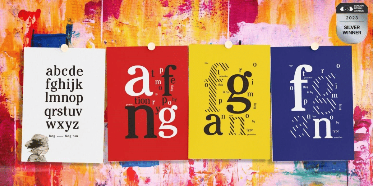
The “Fang Typeface” is an artistic design and graphic layout font created by Fang Nan, using the hand-drawn 26 English letters as basic design elements. Named after Fang Nan herself, this font set is considered a successful exploration by the Chinese artist, who, having previously focused on content creation, entered the fields of graphic layout and character design.
A few months ago, the “Fang Typeface” made its debut during the 2023 London Design Awards and was honored with a “Silver Award.”
Fang Nan’s project “Fang Typeface” aligns with the innovative concepts advocated by the competition from the perspectives of design language and current trends.
It is worth noting that the new member of this graphic layout and character design family, the “Fang Typeface,” has not yet been authorized for use by any organization or individual, making it Fang Nan’s “exclusive” font.
Industry experts commented that a designer with a “personal exclusive font” is likely to be perceived favorably among multinational corporate clients with global influence. Clients have reason to believe that artists who can define and design industry-recognized character tools may bring fresh and independent creative works.
What are the features of the “Fang Typeface”?
How does a font set appear as “artwork” in the London International Design Awards and showcase its aesthetic characteristics to judges and the public?
In response to this, Fang Nan provided a brief introduction, stating, “The entry I prepared for the London Design Awards is a series of posters made with my own designed font, which I named ‘Fang Typeface’ in English after my name. This series of posters is also an exploration of the creative space between graphic layout and character design.”
To highlight the presentation effect and visual impact of the font in each poster, Fang Nan used her personally designed “Fang Typeface” as the basic compositional element for the graphics in every creative and design process. She unified the display of different forms and sizes of character elements using the primary colors “red, yellow, and blue.”
Fang Nan’s creative strategy in character form and color usage injects vitality and spirit into the works, giving the judges a cohesive and original artistic essence. By emphasizing the style of color and font design, the works convey Fang Nan’s intentions and expressions in emotion and thought.
Fang Nan also discussed some unique aesthetic effects and interactive features experienced by readers and viewers during their interaction with the “Fang Typeface.”
One is the use of the “three primary colors” to render the originality of characters. The bold use of the three primary colors, red, yellow, and blue, visually connects characters and serves as a common element from character form, color to layout effect, unifying the logical presentation and stylistic expression of the entire poster series. During the competition, this bold use of the three primary colors was considered to demonstrate the artist’s mastery of color sensitivity and overall visual effects.
The second is the conveyance of the beauty of visual language. Through the series of poster works, Fang Nan creatively emphasized her personal pursuit of “visual language and aesthetics.” She stated, “The ‘Fang Typeface’ not only presents my long-term understanding of design but also showcases my sensitivity to art and aesthetics, making the works more appealing in visual expression.”
The third is the innovative conveyance of emotion and thought. In addition to achieving visual expression tools and stylistic innovation, this series of poster works also highlighted the emotional and intellectual tension conveyed through color and font design and layout. This multi-layered, multidimensional expression adds depth and meaning to the works.
“My works demonstrate a deep exploration of unique fonts, innovative layout, color application, and artistic aesthetics in the creative and design process,” Fang Nan said when reflecting on the reasons behind the success of the Fang Typeface poster works in winning the London Design Award. “These features and highlights make my entry stand out in the competition, adding unique competitiveness to it.”
IKEA’s Inspiration and Freedom
As a designer adept at extracting aesthetic elements and creative inspiration from everyday life, Fang Nan’s influential works in 2023 include the redesign of the IKEA App icon and user experience design for strategic research.
Fang Nan’s innovative approach in meeting the brand’s core demands and showcasing professionalism is evident in the award-winning work, IKEA Icon Redesign.
When discussing the reasons why IKEA Icon Redesign was able to simultaneously receive the German iF Product Design Award and the Muse Design Award, Fang Nan reflected, “The iF Design Award typically highly values designs that are simple yet expressive. The aesthetic balance between simplicity and expressiveness in IKEA Icon Redesign may have captured the attention of the judges.”
Furthermore, Fang Nan believes that in the creative and user interaction design process of IKEA Icon Redesign, emphasis was placed on the alignment of the new logo with IKEA’s brand values and philosophy. This highlighted the brand’s product features and advantages in sustainability, practicality, and innovation. Additionally, attention was given to the adaptability and expanded application experience of IKEA Icon Redesign and the app across multiple platforms and terminals, potentially enhancing its weight in the minds of the judging panel.
“In general, to highlight understanding of design language and consider user needs, designers need to achieve a balance in design goals such as brand consistency, user-friendliness, adaptability, emotional connection, and sustainability,” Fang Nan summarized. “This design approach ensures that the new icon redesign not only adheres to brand standards but also leaves a profound and positive impression in the minds of users and audiences.”


