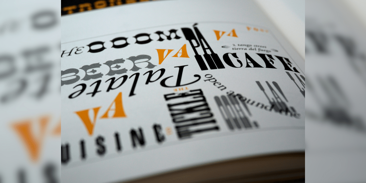
Image commercially licensed from Unsplash
Font styling – it might sound like a fancy term for clicking the bold button, but it’s so much more! It’s the secret sauce that transforms everyday text into a visual feast, guiding readers through your content and amplifying your message. Forget the default settings; delve into the captivating world of intentional font styles and discover how to wield it like a wordsmith’s wand.
The Dance of Hierarchy
Imagine your text as a bustling symphony orchestra. Every element has its role, and font styling is the conductor, ensuring each voice is heard at the right volume and at the right time. Use size and weight strategically. Headline with booming bass tones of a larger, bolder font, while supporting points sing a clear soprano in regular weight. Subheadings can bridge the gap with a mezzo-soprano voice, slightly larger but not stealing the spotlight. Remember, hierarchy isn’t just about size; experiment with italics, underlining, and even color to differentiate roles within your text.
Mood and Setting
Think of your font choices as setting the stage for your content. A light, airy script font transports readers to a breezy café, while a stark, geometric typeface evokes the sharp lines of a modern skyscraper. For a whimsical children’s story, playful bubble letters might be perfect, while a historical essay demands the serifed elegance of Times New Roman. Align your font style with the mood and setting you want to create, and watch your content come alive.
The Power of Personality
Fonts have personalities, too! A playful handwritten font speaks of a friendly, approachable brand, while a sleek sans-serif screams modern efficiency. Think of your brand’s voice and choose a font that embodies it. Is it quirky and fun? Opt for a bouncy display font. Serious and authoritative? Lean towards a classic serif. Remember, your font choice is an extension of your brand identity, so choose wisely!
Contrast – The Spice of Life
Just like a bland dish needs a dash of salt, text needs contrast to sparkle. Don’t be afraid to play with different styles within your content. Pair a bold heading with a light, airy body text for easy reading. Use italics for emphasis, or introduce a contrasting font for quotes or pull-out sections. But remember, contrast is like spice – a little goes a long way. Too much clash can overwhelm your readers.
Readability Rules
Let’s not get lost in the stylistic frenzy and forget that ultimately, text needs to be read. Avoid overly ornate fonts that are difficult to decipher, and stick to readable sizes and spacing. If you’re using multiple fonts, ensure they complement each other, not compete. And remember, sometimes the simplest choices, like a clean sans-serif font with ample line spacing, can be the most effective.
Font styling is a powerful tool, but wield it with intention. By considering hierarchy, mood, personality, contrast, and readability, you can transform your text from everyday words into a captivating visual experience. So, go forth, explore the vast world of fonts, and let your inner typographic artist shine!
Bonus Tip: Remember, tools are there to guide you, not limit you. Online font pairing generators and style guides can offer inspiration and suggestions, but the final decision rests with your creative vision.
Published by: Martin De Juan


